Pie charts
Pie charts use different-sized sectors of a circle to represent data.
The How many times a value occurs. of each item is represented by the size of the angle of the sector.
They should be clearly labelled, either directly on the pie chart or by means of a colour-coded key.
Constructing a pie chart from a frequency table
To produce a pie chart, data is required. The data often comes in the form of a table.
To create a pie chart, the size of the angles needed must be calculated.
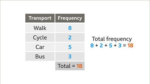
- Add the total frequency in the table.
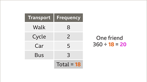
- Divide 360° by the total frequency.
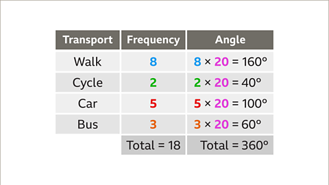
- Multiply each frequency by this value. These are the angles for each sector.
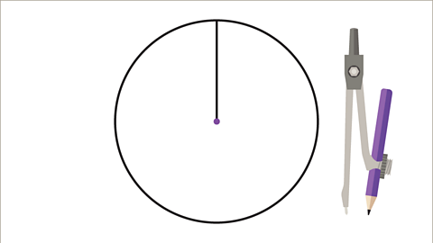
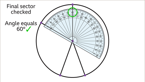
- Construct a circle and draw a vertical line from the top to the centre.
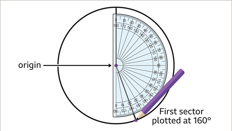
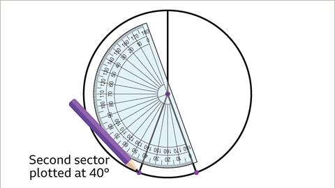
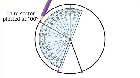
- In a clockwise direction, use a protractor to plot each angle in turn.
- Label each sector or use a key to colour code each.
- Give your pie chart a title.
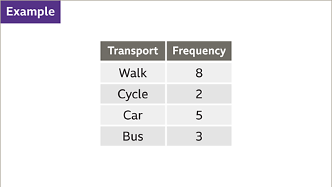
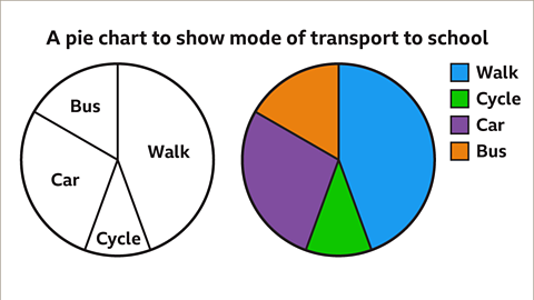
Image caption, A student asked their friends how they got to school. The table shows the results. Construct a pie chart to represent the data.
1 of 10
Interpreting pie charts
The frequency of each item is represented by the angle of each sector in a pie chart.
To calculate the frequency for a sector:
- Measure the angle for the sector using a protractor;
- Write the angle as a fraction of the full circle, 360°
- Multiply by the total frequency.
Example
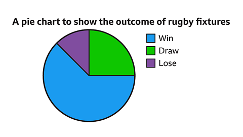
This pie chart shows the outcomes of 24 rugby fixtures.
It is clear to see that the team won most of their matches as win is the largest sector and it is more than half.
How many games did the team draw?
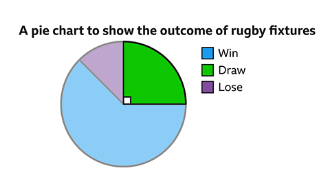
Answer:
Draw is the green sector.
Measure the angle for the sector using a protractor;
The angle for draw is 90°Write the angle as a fraction of the full circle, 360°
\(\frac{90}{360}=\frac{1}{4}\)Multiply by the total frequency.
\(\frac{1}{4}=\times 24 = 6\)
The team had 6 draws.
How many games did the team win?
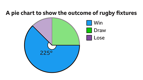
Measure the angle for the sector using a protractor;
The angle for draw is 225°Write the angle as a fraction of the full circle, 360°
\(\frac{225}{360}\)Multiply by the total frequency.
\(\frac{225}{360}\times 24 = 15\)
The team won 15 games.
A pie chart may have percentages to show what each part represents.
To calculate the frequency from a percentage:
- Write the percentage as a fraction of 100.
- Multiply by the total frequency.
Example
This pie chart shows the favourite hobbies of 660 pupils.
How many pupils said sport was their favourite hobby?
To calculate the frequency from a percentage:
Write the percentage as a fraction of 100.
\(\frac{45}{100}\)Multiply by the total frequency.
\(\frac{45}{100} \times 660 = 297\)
Sport was chosen by 297 pupils.
Question
The pie chart shows the types of pizza sold during one evening at Milo’s Pizza Van.
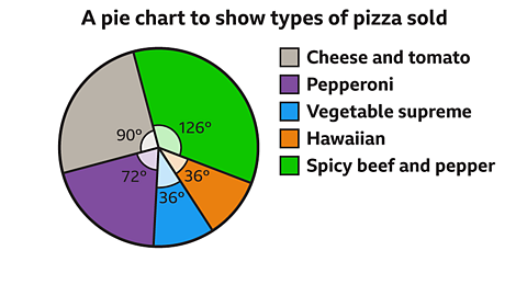
How many of the 240 pizzas sold were spicy beef & pepper?
Answer:
\(\frac{126}{360} \times 240 = 84\)
84 pizzas were spicy beef and pepper.
Test yourself
More on M1: Handling data
Find out more by working through a topic