Monotone and duotone
Tone does not have to be used realistically.
In graphic communication and design, Shown in a particular style, rather than in a realistic or natural way. images can be created by limiting the number of tones or colours used.
Monotone
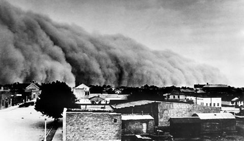
Monotone means using only one colour. This is particularly used to mean black and white. Many photographers choose to work with black and white images. Removing colour means that the images rely fully on tone to describe light, shape and form.
Monotone images can be very eye-catching because of the natural high contrast between black and white. However, the range of tones used will change how bold or subtle the final piece is.
Duotone
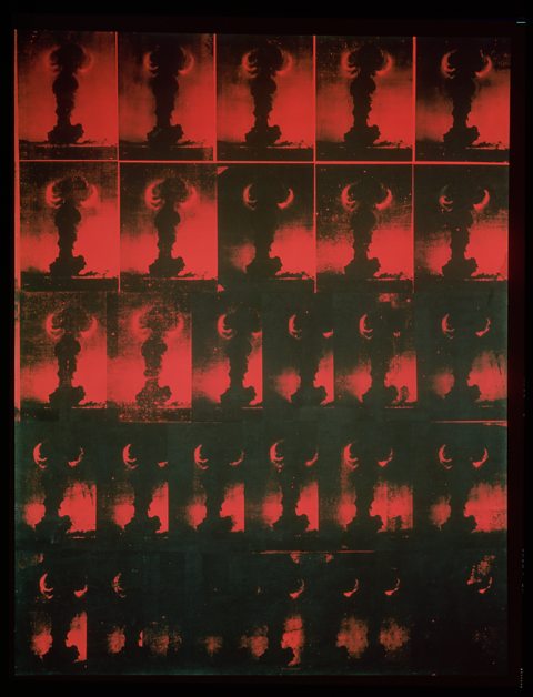
A duotone is similar to a monotone but is made up of two colours rather than black and white. The choice of colours lets an artist or designer make an image seem warm or cool, bold or subtle.
Andy Warhol based Atomic Bomb: Red Explosion (1965) on a newspaper image of a mushroom cloud from a nuclear explosion.
The original image would have been printed in monotone but Warhol changes this for black and red duotone. This still suggests an image printed repeatedly in newspapers but one that has become unnaturally stylised or even sinister.
Why use monotone or duotone?
Using monotone and duotone can be aesthetic choices that create a particular mood. They can also be chosen for practical reasons:
- It can be simpler to make an image from a limited number of colours.
- Printing with limited colours can be cheaper.
- Very different images can be unified when printed in monotone or the same duotone colours.
- Duotone images can be linked to a particular brand if printed in the brand colours.