Creating atmosphere
Tone can be used to create atmosphere in art and design work. Different atmospheres will be created depending on the value and contrast of the tones used.
Value
Value refers to how light or dark a tone is.

Dark tones are said to have low value.
Westminster, Evening (Joseph Pennell, 1909) is dominated by use of low value tones that create the appearance of a dark night. The viewer has to work to make out the shapes of buildings and clouds. Small spots of much brighter tones effectively suggest lights and their reflections in the water.
Light tones are said to have high value.
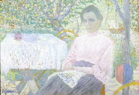
In Woman reading newspaper (c.1905-1906), Kazimir Malevich uses high value tones to suggest bright sunlight. These light tones are used throughout the composition, creating a calm, tranquil atmosphere.
Contrast
Contrast refers to the difference between tones.
A small amount of contrast, or low contrast, between the lightest and darkest tones will tend to result in a more subtle or calm image.
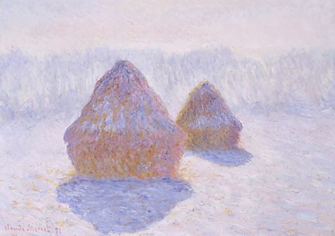
In Haystacks (Effect of Snow and Sun) (1891), Claude Monet uses a limited colour The range of colours used in a piece of art or design. with high and mid-value tones. These suggest gentle winter light on a hazy, misty day.
The greater, or higher, the contrast of tones, the more dramatic the atmosphere.
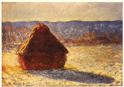
Maystack, Morning Snow Effect (Claude Monet, 1891) has a much wider range of tones. High values suggest bright, direct light hitting the snowy field and the left side of the haystack. Contrast is created by much lower value tones that show deep shadow.
Chiaroscuro
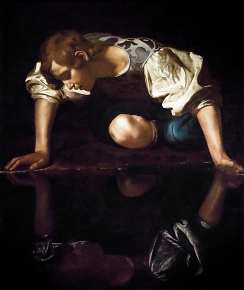
The term chiaroscuro is used to describe images with very high contrast. Chiaroscuro comes from two Italian words – 'chiaro' meaning light and 'scuro' meaning dark.
Narcissus (c.1597-99) is typical of Michelangelo Caravaggio's use of chiaroscuro. A black background and very dark shadows in the water and the folds of the figure's clothes make his white sleeves and the pale skin of his face, arms and knee stand out dramatically.