Temperature
Warm and cool colours
The twelve part colour wheel can be split in half into a section of six warm colours and a section of six cool colours.
Warm colours remind us of things associated with the concept of heat such as summer, beaches, the sun, fire etc. The warm colours are:
- Red-purple
- Red
- Red-orange
- Orange
- Yellow-orange
- Yellow
Cool colours remind us of things associated with the absence of heat – such as winter, ice, water, etc. The cool colours are:
- Purple
- Blue-purple
- Blue
- Blue-green
- Green
- Yellow-green
Using warm and cool colours in a painting can have different effects.
Warm colours
Warm colours are said to advance towards you as if they are jumping out of the painting. These colours can be exciting and energetic and will catch the viewer’s attention by drawing their eye towards them.
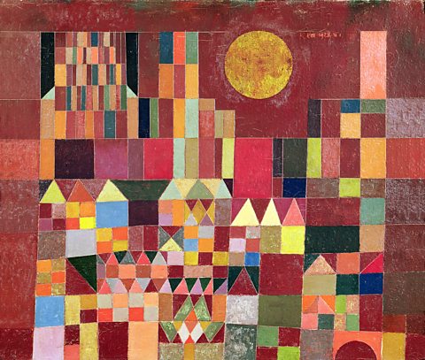
Castle and Sun (Paul Klee, 1928) features a number of different colours but is dominated by the reddish brown of the background and the bright yellow sun.
These and the many red, yellow and orange shapes that make up the buildings create a warm image that suggests hot sunlight shining down on the scene.
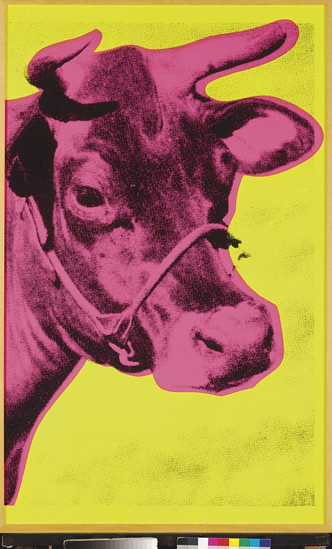
Andy Warhol’s Cow (1966) was one of a series of brightly coloured prints used as a wallpaper design.
Warhol deliberately used bright and unnatural warm colours. These strong colours advance and stand out so that they catch the viewer's eye when hung on a wall.
Cool colours
Cool colours are said to recede into the background, meaning that they move away from the viewer. Cool colours can be calming and relaxing but can also be used to signify sadness.
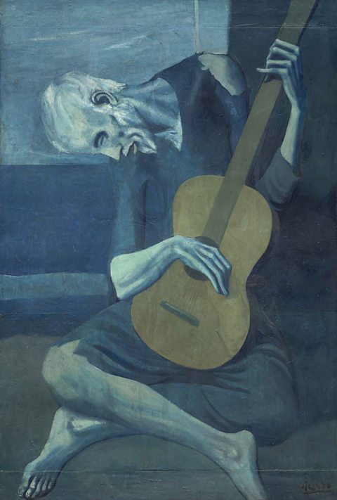
The Old Guitarist was painted by Picasso between 1903 and 1904, during his Blue Period.
It features cool colours including dark blues, light blues, some turquoises and greens. The mood seems sad or even bleak.
The only warmth comes from the brown of the guitar. This suggests a single source of comfort and warmth in the man’s life.
Combining warm and cool
Warm and cool colours can be used together to create a sense of drama, to add interest and contrast, or to balance the temperature of a composition.
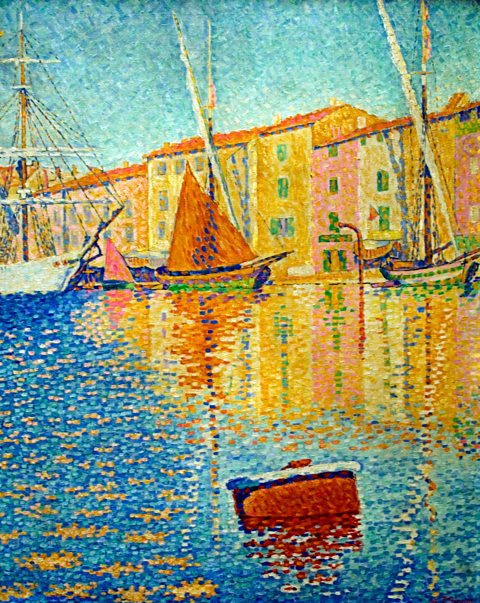
Paul Signac painted The Red Buoy using different temperatures of colour. The colours used make this a very bright and vibrant painting.
The painting of a harbour in the South of France uses warm colours such as reds, yellows and oranges to communicate a feeling about sunshine and heat.
These are balanced by the cool blue of the water and the green shutters.
This balance makes the scene look pleasantly warm rather than just hot. Signac’s choice of colour means that the viewer gets a feeling of a warm summer’s night as the sun sets on the village.
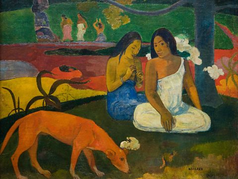
Arearea (Paul Gaugin, 1892) uses warm colours to evoke a sense of the hot, tropical climate of Tahiti. The unnatural colour choices help the viewer to gain a sense of the exotic location Gaugin was painting in.
Again, cool greens are used to balance the warm colours and make the idea of heat less intense.
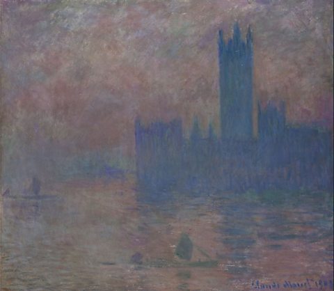
Monet's painting Houses of Parliament (1903) shows a dramatic scene suggesting a sunrise or sunset on a cold winter's day.
The warm red, orange and yellow of the sun advance and stand out against the contrasting cool blues and purples which recede into the background.