Please read the Licensing terms before you download this content.
Overview

How it works
Other patterns referenced in onboarding are: sign in or register Call To Action (CTA) and content utilities.
After selecting your app launcher icon on the phone home screen, you'll briefly see the app launch screen before arriving at the first of the onboarding screens.
All onboarding uses a full screen layout, with or with the app bar (depending on whether you have progressed past sign in).
The app bar is included after someone signs in and is officially in the app. Although, you could choose to have a transparent background to your app bar so only the logo or title text may be visible. At this point, you can start requesting information from that person to enhance their app experience. Examples might be inputting their name or selecting topics or subjects.
There are two main types of onboarding screens; the **features upsell **and the information gathering screens.
Features upsell
Most upsell screens will be image-driven, supported by text and have the product brand at the top. There can be more than one upsell screen. If there is, you can swipe forwards and backwards to move between them. You'll be able to tell how many there are thanks to the pagination.
At the bottom of every screen, there will be a CTA. Select this to take you to the next stage of the upsell. See this guideline's rules for more details on the CTA.
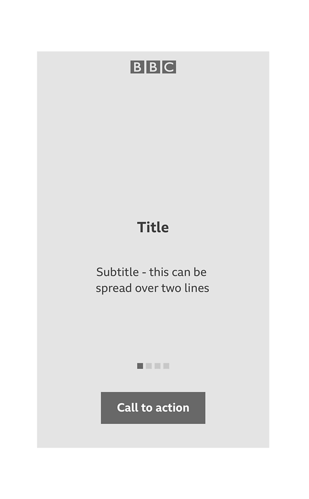
If the main CTA is being used to continue into enabling a feature (such as push notifications), a 'skip' or 'no thanks' CTA should be included in the top right of the screen.
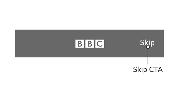
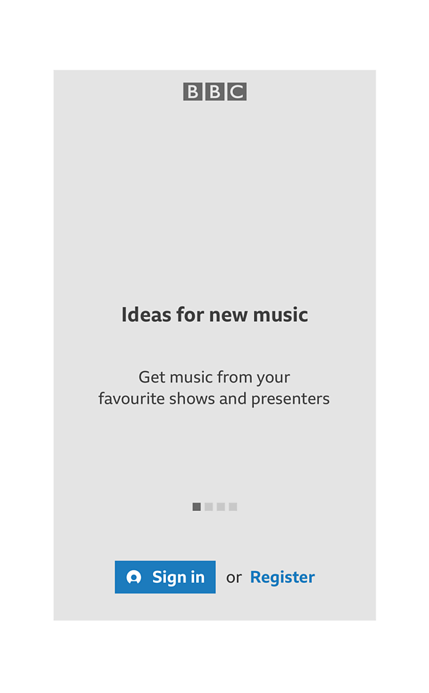
For upselling a ����tv account, you should replace the main CTA with the sign in and register CTAs. Please see that pattern for the latest guidelines around those CTAs.
Upsell screens will also have supporting text. These should clearly show the benefits of signing in.
Selecting 'sign in or register' will take you through the ����tv account sign in journey which will be shown in app, using an in-app web view.
This pattern can also be used without the pagination as a 'welcome' screen, following successful my����tv sign in. This is the first time you see the app's top navigation app bar. This will feature the title of the screen, centered in the bar.
The 'welcome' screen includes:
- A welcome message
- An optional visual treatment (e.g a full bleed background image, illustration, animation or GIF)
- Supporting text
- Button to continue to the next step
Selecting the CTA takes you to the next step. This will either be the app 'home' screen or the 'information gathering' screens.

'Information gathering' screens
The 'information gathering' screens allow people to personalise their experience. This is done by choosing catagories (e.g topics, sports, subjects) that interest them or by inputting useful data.
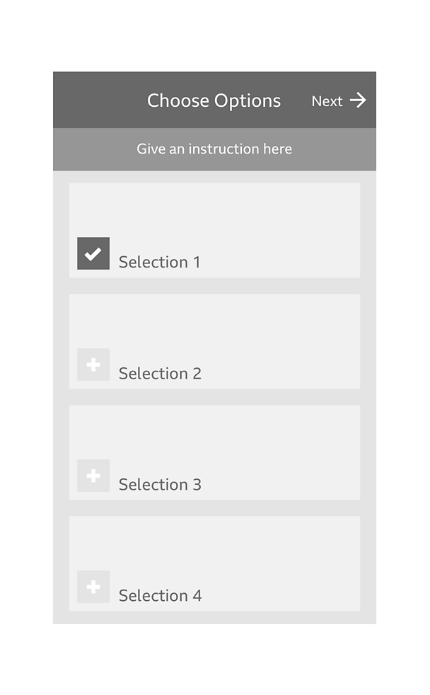
When someone is signed in, the 'information gathering' screens will include the app bar. At this point, the app bar shows the screen title (centered) and a 'next' CTA to allow you to progress through the screens. A supporting line of text can be used to give more information or instructions.
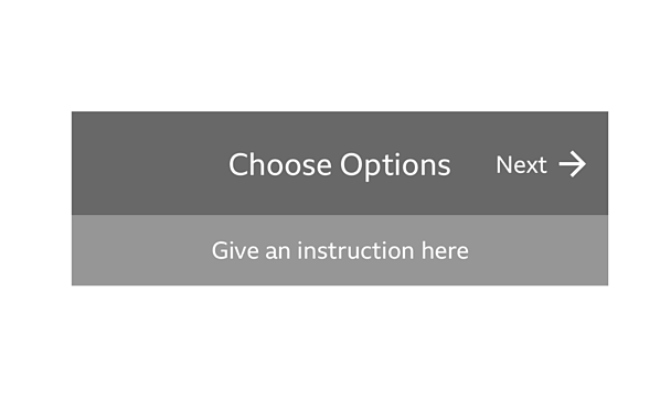
If you need someone to make selections from a list of choices you can use a series of checklist items. Checklist items allow you to add topics. A checklist item is made up of two parts;
- 'Active' or 'inactive' icon
- Label
An 'add' icon is used to show the inactive topics that are yet to be chosen. Once a topic is selected the 'add' icon changes to the GEL 'yes' icon to indicate that the topic is now active. You must choose at least one topic to move forwards to the next screen. After making your selections, you press the 'next' CTA to progress on iOS and Android platforms.
Rules
Features upsell
- Upsell must have a minimum of one screen and a maximum of four
- The product branding must be in the top portion of the screen
- The layout hierarchy should remain the same throughout all ����tv apps

- The headline or subtitle can be turned on or off. But at least one of these must be shown
- Subtitles can use a maximum of two lines
- The CTAs should be shown and active on every screen
- The CTAs should always be included to allow people to continue their journey (auto-advance should not be used)
- The 'welcome' screen should only be used to welcome someone into the app after sign-in or registration
'Information gathering' screens
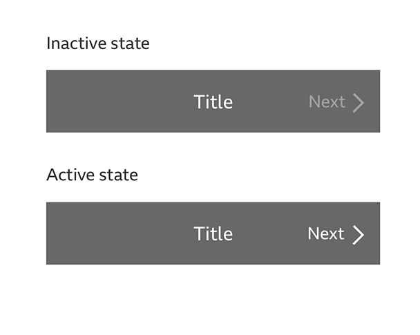
The 'next' CTA must stay inactive until either a choice is selected or data is inputted.
- The 'add' button should always be to the left of the category title
- The 'tick' icon should always be used to show that a category has been selected
- There should be a minimum of two categories to choose from
Variations
Features upsell visual treatment
The 'features upsell' screen can be changed to suit a wide range of products. These variations can include a number of things, appropriate to each product:
- Backgrounds can have full-bleed imagery with colour tint, an illustration or small animations (as long as the hierarchy stays the same)
- Supporting text highlighting benefits or features
- Product branding
- Animated transitions between upsell screens
- Visual treatment can differ depending on the brand or product
For more details on branding and visuals, see our downloadable assets at the top of this page.
'Information gathering' screens
- The layout of the checklist item can be changed to suit your product needs. Please see the variations section of the topic management pattern for guidance.
- Some products may only allow for one selection, for example 'language selection' in Bitesize. At the moment, you should still use the 'add' icon to make the selection.
- Instead of the 'next' button in the top bar, a more explicit CTA may be used to advance. This may be particularly useful for younger audiences.
Pattern in action
This pattern is currently being used by the ����tv Bitesize app and the ����tv+ app, available here:
/
Licensing
These assets are available for download on the following licence terms:
You can:
- Download the assets and use them free of charge;
- Use the assets without attribution; and
- Modify or alter the assets and edit them as you like.
You can't:
- Use the assets in a way that would bring the ����tv into disrepute;
- Make available the assets so that they can be downloaded by others;
- Sell the assets to other people or package the assets with others that are for sale;
- Take payment from others to access the assets (including putting them behind a paywall);
- Use the assets as part of a service that you are charging money for; or
- Imply association with or endorsement from the ����tv by using the assets.
Disclaimer: The assets are offered as is and the ����tv is not responsible for anything that happens if you use them.


