Please read the Licensing terms before you download this content.
What is an infographic?
The term 'infographic' comes from 'information graphic' - a visual representation of information or data. They should educate and inform people in a quick, clear and engaging way.
At the ±«Óătv, our infographics usually fall under one of four categories:
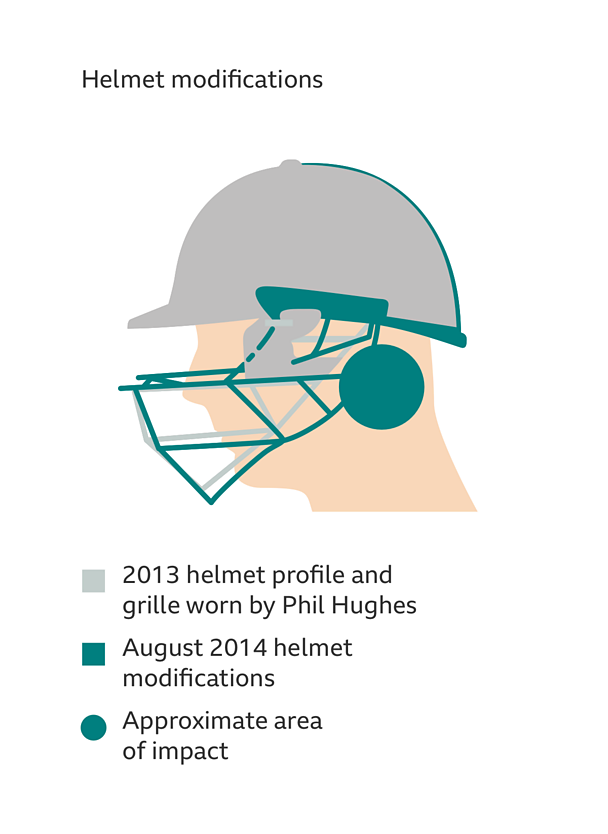
Diagrams/technical illustrations
These are usually an illustration of a physical object or some kind of process.
The most important elements will be labelled to show people where the key information is.
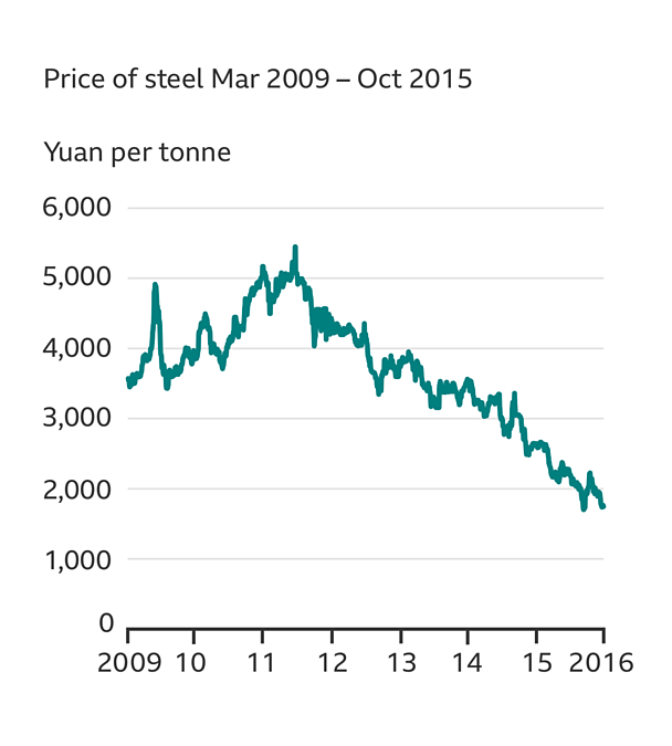
Data visualisation
This type of infographic helps people find meaning in data. The simplest ones highlight a single value, compare one value against another or compare values over time. The most common forms are column, bar, line and pie charts.
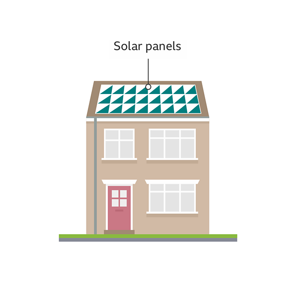
Annotations
As soon as you add a label to an image, it arguably becomes an infographic. Labels can be used to highlight key information within the image.
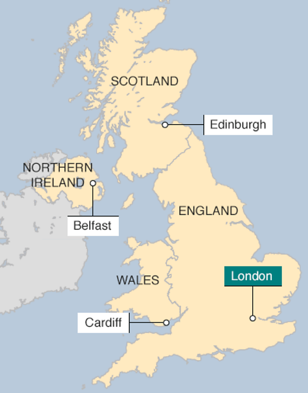
Maps
We use maps to show where things have happened and the relationship between events in an area. These are usually two-dimensional plan views of three-dimensional space with labels, keys and scales to help people understand a story.
What makes a good infographic
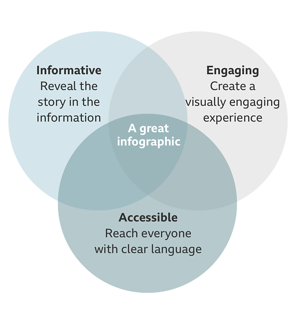
Good infographics should aim to follow some of these principles, a great infographic will follow all three…
Informative
Be informative, accurate and reveal the story in the information. We must add value to our infographics, presenting what text alone can't communicate. Generally we aim to bring clarity and understanding where there is complexity and confusion.
Engaging
Create a visually stimulating and engaging experience that will capture the viewers attention and be something they'll want to spend time reading. You should invite people to explore and contemplate and help them find personal relevance and context.
Accessible
Aim to reach all audiences by communicating with the clearest language and the simplest techniques. Remove the unnecessary visual clutter to create a clear and simple experience. And remember, some people physically see things differently or not at all.
Infographic visual style overview
Illustration
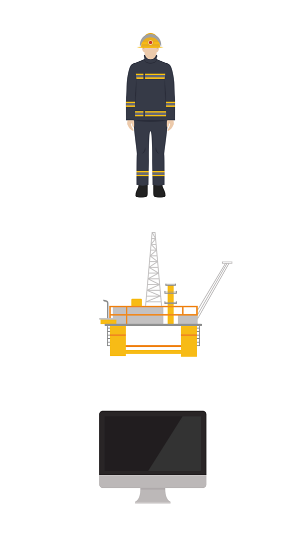
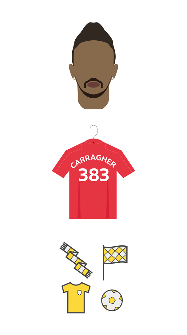
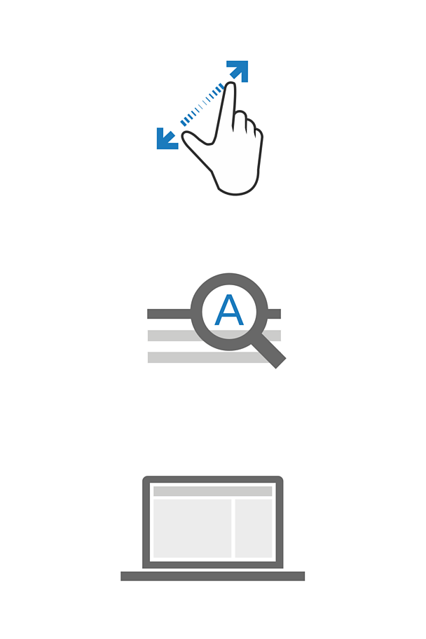
Our overall visual style is minimal and visually engaging but with a neutral tone. News, Sport and GEL have their own distinctive style that compliments their brand and editorial values.
Simplify the complex
Reduce the amount of unnecessary information, so the important things are clear.
Use colour with care
Use a neutral colour palette so important information stands out more in comparison.
Don't convey meaning with colour alone. Not everyone sees colours the same. Combine colour differences with shape variety, patterns or icons. For example, the GEL infographics use green and red circles combined with tick and cross icons to show correct and incorrect designs. The colour and meaning guideline gives more information.
Consider tone
Consider the tone of the story and people's expectations. Too simple and the illustrations may look playful, too detailed and they might become too real or serious.
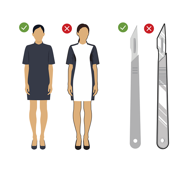
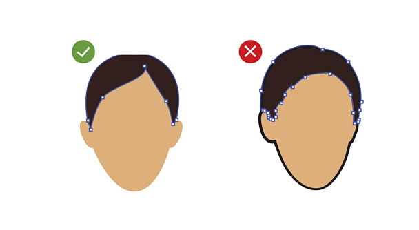
Remove unnecessary details to make a graphic easier to read. Avoid decoration and make things simple. But also don't overdo it and give things a cartoonish tone. If you're using digital illustration software, use minimal points on BĂ©zier curves.
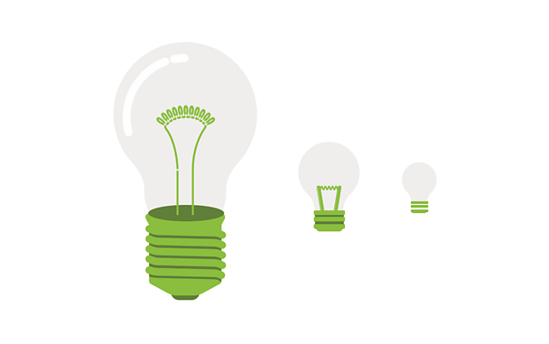
Scale
The smaller the image is, the less detail you need.
Visual style variety
Here's an overview of the elements across ±«Óătv News, Sport and GEL.
±«Óătv News examples
±«Óătv Sport examples
±«Óătv GEL examples
Colour palette
Each ±«Óătv product has its own specific colour palette for infographics. These colours are carefully chosen to compliment the brand colours of that product.
Within each product we use a set range of colours when illustrating certain things such as buildings or nature. We also use set colours to highlight key information to make an infographic easier to understand.
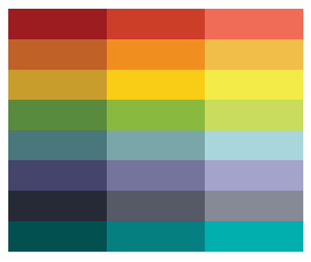
The full range of palettes can be found in the downloadable infographics asset file. This can be found via the link at the top of this page.
Visual style consistency
Here's an overview of the elements of visual style which are consistent across all ±«Óătv products.
Typography
±«Óătv Reith is used as our main typeface for all infographics. For type sizing the GEL typography guideline should be followed where possible.
To optimise infographics across all devices, they are generally created in three different sizes: small, medium and large. The table below shows how the infographic text attributes can be applied using the GEL typography sizes.
Text colour should contrast well with the colour or colours behind it. The colour contrast guideline gives more information.
| Example usage | Type sizes |
|---|---|
| Title | Great primer |
| Subheader | Great primer |
| Label | Pica |
| Source | Brevier |
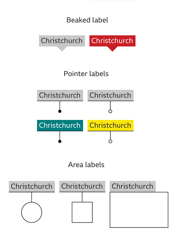
Labels
We design labels to be as consistent as possible across the ±«Óătv, though we can change the colour and style of label where appropriate.
Responsive infographics
We design infographics to give a good experience across a range of devices and browsers.
Infographics are created at up to three different sizes: small, medium and large. Depending on the size of someone's display, a different graphic will be shown. For example, if you're on a small screen, like a phone, you'll see the small graphic.
To give the best reading experience, infographics have a different layout depending on what size they are. Small (mobile) is presented as a vertical stack while medium (tablet) and large (desktop) have a more horizontal layout.
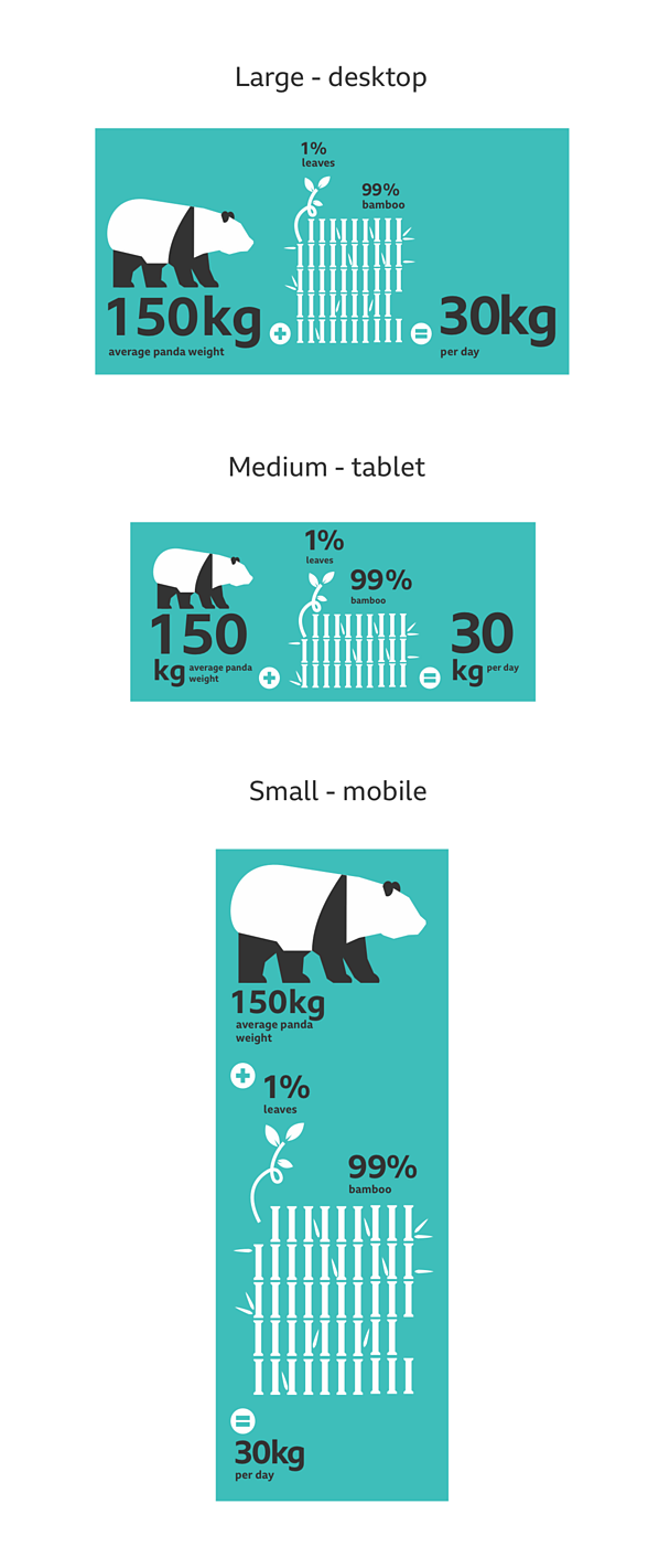
Infographics adapt in size to best fit the device/browser, but we have fixed widths at which we create them (we do not have fixed depths).
The widths below show the best averages that we use to scale our adaptive infographics across devices.
| Small | Medium | Large | |
|---|---|---|---|
| Graphic width (px) | 400 | 750 | 976 |
| Device ranges (px) | 0 - 400 | 401 - 750 | 751 - 976+ |
Accessibility
Some key considerations when creating infographics are:
- Colour contrast - Text colour should contrast well with the colour or colours behind it.
- Colour and meaning - Meaning should not be implied by colour alone.
- Text alternatives - Text that is only part of an infographic (jpg, gif or png) is not accessible. Neither is an image without a text alternative.
You can find out more in our how to design for accessibility guideline or visit the ±«Óătv mobile accessibility guidelines.
Licensing
These assets are available for download on the following licence terms:
You can:
- Download the assets and use them free of charge;
- Use the assets without attribution; and
- Modify or alter the assets and edit them as you like.
You can't:
- Use the assets in a way that would bring the ±«Óătv into disrepute;
- Make available the assets so that they can be downloaded by others;
- Sell the assets to other people or package the assets with others that are for sale;
- Take payment from others to access the assets (including putting them behind a paywall);
- Use the assets as part of a service that you are charging money for; or
- Imply association with or endorsement from the ±«Óătv by using the assets.
Disclaimer: The assets are offered as is and the ±«Óătv is not responsible for anything that happens if you use them.


