Choosing the right way to present data

Science experiments give results which are presented in a range of ways:
Drawings or photographs are useful to ways to present data which doesn't have a numerical value such as observations of the seasons or imagine if you found a new type of cell. A drawing or photograph would be the best way to present this. Scientific diagrams are different from those in art. They are more simple without areas of shading.
Bar charts help us present Data that can be counted in whole numbers only. where the answers are whole numbers and the results which can be presented in any order. It wouldn’t matter if the chart showed the colours in the order green, brown and blue. Results like this can also be presented in a pie chart.
Line graphs are for used with Data that takes many different values which may not be whole numbers such as height and weight. results which must be in the right order. The time must start at one minute and go in order to five minutes.
Scatter graphs are used when presenting the data in a pattern seeking enquiry looking at patterns between two different variables.
Scientists write their findings up into short articles which are published in books called journals.
Examples of how to present data
Results from experiments are often presented in tables and shown in charts and graphs to make them easier to understand. Here are three examples looking at eye colour, reactions and age and heart rate.
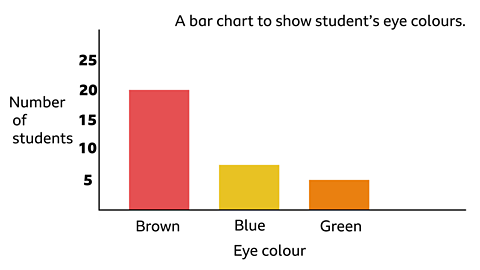
Example 1
| Eye colour | Students in class |
|---|---|
| Brown | 20 |
| Blue | 8 |
| Green | 2 |
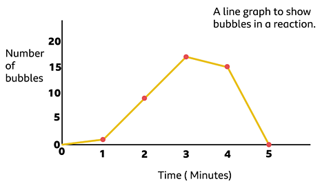
Example 2
| Time taken (in minutes) | Bubbles produced in reaction |
|---|---|
| 1 | 1 |
| 2 | 9 |
| 3 | 17 |
| 4 | 15 |
| 5 | 0 |
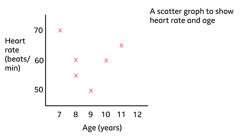
Example 3
| Age (years) | Heart rate (Beats per minute) |
|---|---|
| 8 | 55 bpm |
| 8 | 60 bpm |
| 10 | 60 bpm |
| 7 | 70 bpm |
| 9 | 50 bpm |
| 11 | 65 bpm |
Can you work out why the sets of data are presented using a bar chart, line chart or scatter graph?
Example one: Looks at eye colour which is discrete data therefore we can use a bar chart to present the data as the data is a whole number.
Example two: Looks at bubbles during a reaction over a length of time. This is continuous data so is best presented in a line graph.
Example three: Looks to see if there is any pattern between age and heart rate so is best presented in a scatter graph.
Activity 1: Quiz
Activity 2: Presenting data

Ask a responsible adult to help you with this activity.
You will need a pen or pencil and some paper. Go or look outside and collect a tally chart of what you see.
You could record a tally of the different colours of cars or the number of birds in your garden or local park at different times of day.
Think about the best way to present this data. Are you going to use a:
- bar chart
- line graph
- scatter graph
More on Working scientifically
Find out more by working through a topic
- count11 of 11
- count1 of 11

- count2 of 11

- count3 of 11