How can we compare data?
Tables, pictograms and bar charts are a great way to compare and ask questions about results.
Tables
Tables use numbers. This table shows you the amount of flowers that were planted in a garden.
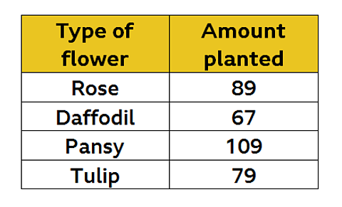
By looking at the table, you can easily compare the numbers.
Let's use the table to answer some questions.

Which flower was planted the most?
For this question, you look for the largest value in the column titled 'Amount planted' .
You can see that the pansy was planted the most.
How many more roses were planted than daffodils?
This question is asking you to find the difference between the two results.
Look at the table again. You need to subtract the number of daffodils (67) from the number of roses (89).
89 ŌĆō 67 = 22
So there were 22 more roses planted than daffodils.
Watch: Using a table to record data
Watch the video below to see a data table being used to record the scores at a mini golf game.
Jeff: ItŌĆÖs a crucial shot for Putter Mulligan against Louie ŌĆśThe EnlightenedŌĆÖ.
LetŌĆÖs check out the score table. Right, what are we looking at here, Janine?
Janine: Ok Jeff, each player has a rowŌĆ”
ŌĆ”and we can show their scores for each hole in columns. Lowest score wins!
Jeff: Louie won the first hole, and Putter won the second.
Janine: And Louie got a hole in one on the third hole!
Jeff: But back to the action Janine, Putter needs a hole in oneŌĆ”
Oh my, itŌĆÖs Louie's Signature Floater!
Pictograms
A pictogram uses pictures or symbols to represent data.

The key shows that one whole circle represents 100 points. This helps you to work out how many points were awarded to each team.
A semi-circle must represent 50 points since itŌĆÖs half of the whole, and a quarter-circle must show 25 points.
How many more points did Sapphire win than Ruby?
This is another subtraction question. Sapphire was awarded 350 points and Ruby have 325 points.
350 - 325 = 25 points
So Sapphire was awarded 25 points more than Ruby.
How many points did Diamond and Emerald get altogether?
The word ŌĆ£altogetherŌĆØ means addition. Both houses have 250 points.
250 + 250 = 500 points
So Diamond and Emerald got 500 points altogether
Bar charts
A bar chart is another visual way to represent data. The heights of the bars let you automatically see the difference in results.

Using the bar chart above, you can quickly see that football was the most popular sport and tennis was the least popular.
Which two sports had a difference of 4 children?
Work out how many children chose each sport and then find the two numbers with a difference of 4.
9 - 5 = 4
Rugby and swimming had a difference of 4 children.
How many children were asked about their favourite sport altogether?
For this question, add up all the results.
3 + 9 + 14 + 5 + 8 = 39
Activities
Quiz
Try this quiz on comparing data.
Activity 2

Compare data by making your own bar chart.
What items do you have in your home that you could compare?
For example, how many tables, lamps, doors or windows do you have?
Choose categories, count the items and draw your bar chart.
NEW! Play Guardians: Defenders of Mathematica - the Halloween update. game
Experience Mathematica as youŌĆÖve never seen it before, with all-new backgrounds and costumes for Halloween. Available for a limited time only. Use your maths skills to save the day before it's too late!

More on Tables, graphs and charts
Find out more by working through a topic
- count6 of 8

- count7 of 8

- count8 of 8

- count1 of 8