Fonts and typefaces
Fonts
A A design of lettering, which is made up of a set of related fonts is the overall lettering design, and a A specific version of a particular typeface - eg bold or italic is a specific version of a typeface. For instance, Arial is a typeface, but Arial Bold and Arial Italic are both fonts.
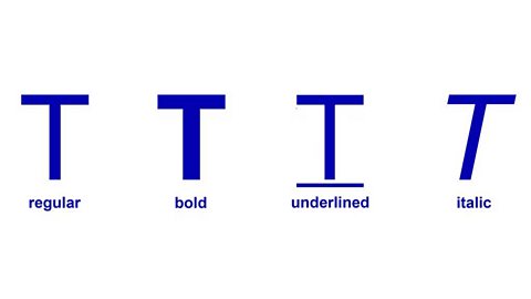
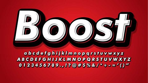
Bold type can add an emphasis or strength to a font.
Underlined type can be used for titles or to draw attention to important text.
Italic type can emphasise an important word or passage of text or for designs where there is a need to create an illusion of speed and energy.
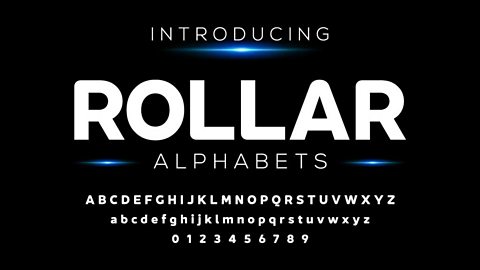
Typefaces
Typeface means a ‘family’ of fonts. Word processors give them names, eg Arial, Chiller, Times New Roman.
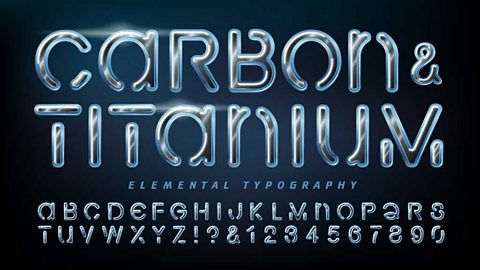
Click through the slideshow to see a range of typefaces:
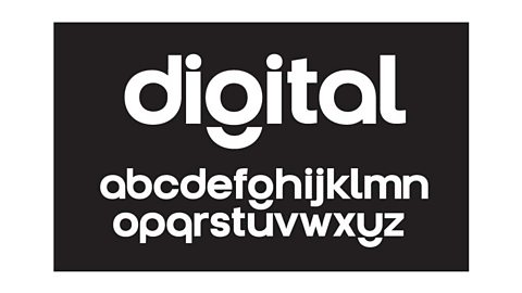
Image caption, This typeface uses circles and semicircles in much of the lettering.
1 of 5
Serif and sans serif
Most typefaces can be categorised as either serif or sans serif. This describes whether or not letters have extended corners, known as serifs.
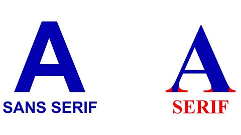
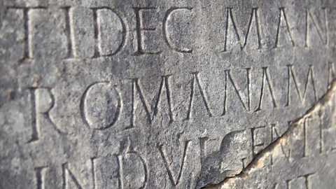
Serifs are the extended corners at the end of letters. Serif fonts look more elegant and traditional, and were commonly used in Roman stone carvings.

Sans serif means without serifs. These are more (legible) and are used for large blocks of text.
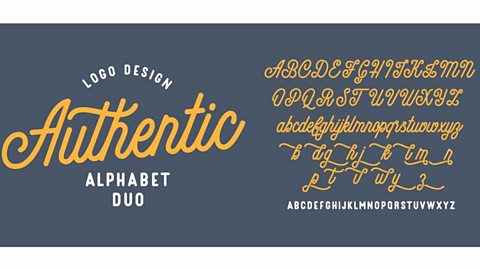
Decorative letter effects
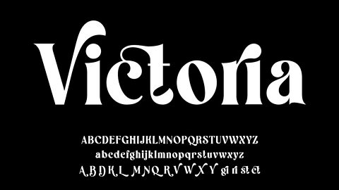
Letter forms can be added to with decorative effects – these add style to the letters, but aren’t always needed for them to be legible. Click through the slideshow to see some decorative effects:

Image caption, Swashes are swirls that make lettering look more elaborate.

1 of 5
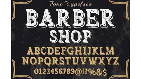
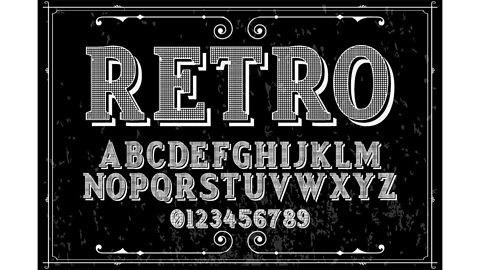
Styles of lettering
There are many different styles of lettering though many of them will fall under one of four categories. Click through the slideshow to see some of these categories:
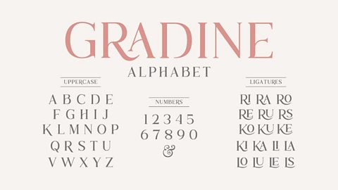
Image caption, Roman style typefaces often have thick and thin stems and serifs.
1 of 3
The final category is copyright style - these are typefaces that are designed for and strongly associated with a particular company or brand.