Creating effective packaging designs
Consideration of pattern, shape, space, colour and texture

Packaging starts with designing and sketching ideas.
Consider what the primary packaging will look like. This will depend on the product and the best way of storing it for example a plastic or glass bottle, a box, a sachet or a tube.
The secondary packaging can then be considered. This might complement or contrast the primary packaging.
A The first working model of a design used for testing, development and evaluation. could help to Imagining or making a mental image of what something might look like the packaging.
It’s important to consider the colour scheme. Think about what colours best reflect the product or the mood you want to create and experiment with different colour combinations.
Consider imagery. Packaging usually has an image of the product and often other images such as characters or pictures.
You might wish to include a pattern to decorate areas of the packaging that don't have any writing or images.
Vary the number of features to change the effect that a package design has on the buyer. Some designs will benefit from lots of information and imagery, but some will work best by using as little as possible. A sleek design with little detail and a few subtle colours can be an effective option.
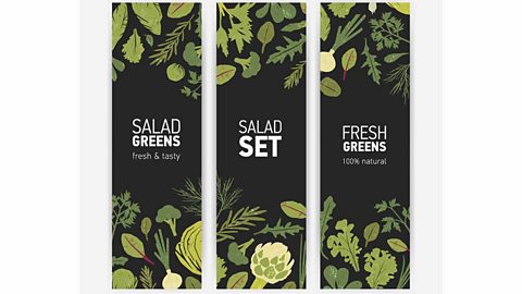
Visual impact
Click through the slideshow to see how simple alterations can make one design fit a range of products:
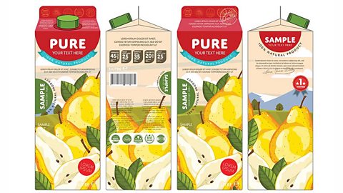
Image caption,
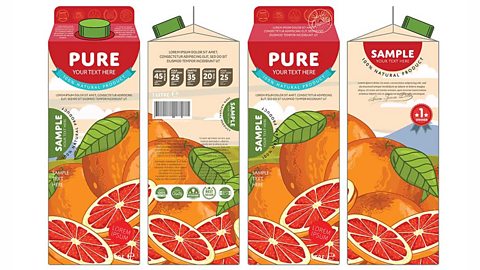
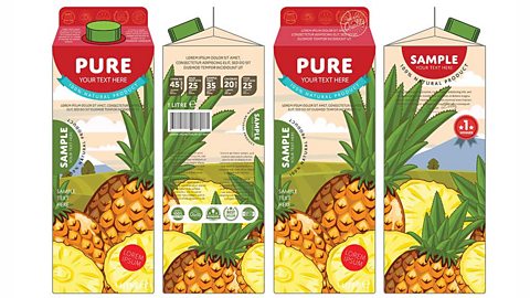
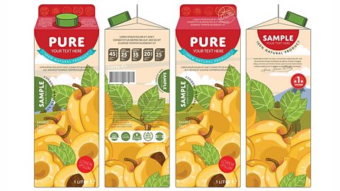
1 of 4
Practise various designs in different ways by changing the product. Think about how the packaging will impact on the consumer and make them want to buy it.
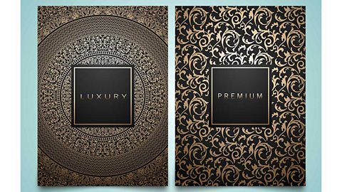
Sometimes a clean and simple design can be effective and make the product appear more sophisticated than packaging with lots of colours, characters and designs.
Using the right typography
Choosing the right typography is just as important as choosing the right material, the right colours and the right graphics.
The text can also communicate and connect with the consumer. So, a playful, rounded and 3D font might attract the attention of a younger consumer, whereas a more traditional style of lettering might appeal more to an older age range.
It is therefore important to remember that every detail which goes into packaging design must be well considered because everything serves a purpose.