Tints, shades and tones
Few artists use only pure colours from around the colour wheel. Often artist will use tints, shades and tones when mixing colours.
A tint is where an artist adds a colour to white to create a lighter version of the colour. An example of a tint is pink. Pink is a tint created by adding white to red.
A shade is where an artist adds black to a colour to darken it down.
A tone is where an artist adds grey to a colour.
Monochromatic
An artist may decide to create a piece of artwork which is Only using or featuring one colour, or using only black, white and grey.. This means that the artist uses tints, shades and tones of a single colour.
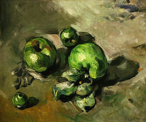
Still Life with Green Apples (Paul Cezanne, 1873) is almost completely monochromatic. The apples are painted using greens that range from very pale near white tints to nearly black shades. The background is made up of green-browns.
The three strokes of red on the apple on the left create contrasts and adds interest. A small amount of yellow is used to add more variety of colour to the bottom left corner and to the apples and their leaves.
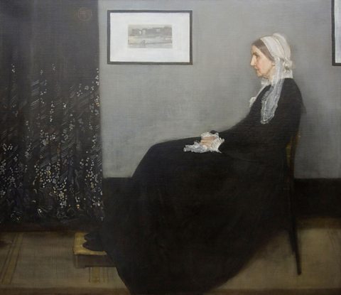
Portrait of the Artist’s Mother (James Whistler, 1871) is almost without colour. The composition is dominated by the large patches of black created by the subject’s dress and the curtain, and the large rectangle of grey wall.
There is stark contrast with the white of the picture frame, the woman’s bonnet, cuffs and handkerchief.
Neutral browns are used for the floor and the step that the woman’s feet rest on. The composition is formal and Relating to geometry and featuring straight lines and regular mathematical shapes and forms such as squares, circles, triangles, cubes and spheres. .
The woman’s face and hands stand out in this stark composition because the tints and tones of red and yellow used make her skin appear bright and warm.
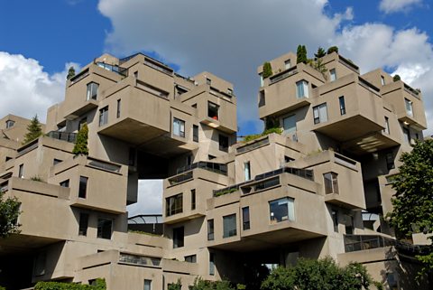
Habitat 67 (Moshe Safdie, 1967) in Montreal is a model housing development based on stacked forms.
The irregular arrangement of these forms could seem chaotic, but the fact that they all share the same grey-brown colour unites them as a composition.
Emotion, mood and atmosphere
Often when an artist uses colour in a painting they are trying to communicate an emotion, mood or atmosphere. They could either be trying to make a viewer feel a certain way or they are trying to communicate their own feelings.
One way to do this is through wider social and cultural ideas we associate with certain colours. Let's take the colour red as an example.
Red

The colour red has many different meanings.
Often we link red to danger. In western culture, red is often used in warning signs or to tell you to not do something, like no smoking. In traffic lights, the colour red is used to mean stop.
Red can also have a link to anger. Cartoons or movies may show a character going red in the face when getting upset. It can also mean embarrassment.
Red can also have positive associations. We link red with love and passion - it appears all over Valentines cards in February. We also see red as a festive colour - the colour of Christmas and Santa Claus.
Different cultures treat colours very differently however. In China, red is seen as a lucky colour. In South Africa red is seen as the colour of death and mourning (which is normally associate with black in the United Kingdom). The use and meaning of colour can vary depending on where artists and their audiences come from.
In this crime prevention poster (Central Office of Information, 1960s), the bright red suggests danger.
The black A (usually dark) shape or outline with no additional features. contrasts with the background and looks sinister.
Often black and red (or orange or yellow) appear together in nature as a warning. For example bees, wasps and even poison dart frogs have markings in these colours to warn other animals away.
The use of red and black together helps fulfill the poster’s purpose of warning us about a possible threat.
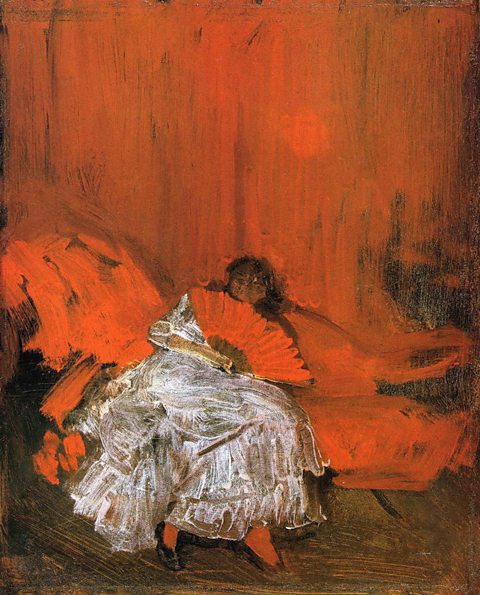
Whistler explored the monochromatic technique again in Red and Pink: The Little Mephisto (1884). By using tints, shades and tones of red, Whistler has created a work with much more energy and passion than in Portrait of the Artist’s Mother.
A single colour can have a number of meanings but it is up to you to form an opinion on why a piece of artwork includes certain colours.
Some further examples of the links and associations with other colours are as follows:
| Green | Yellow | Orange |
| Nature, cool, money, freshness, growth, sickness, jealousy | Happiness, warmth, cheery, laughter, lighthearted | Happiness, enthusiasm, energy, warmth |
| Green | Nature, cool, money, freshness, growth, sickness, jealousy |
|---|---|
| Yellow | Happiness, warmth, cheery, laughter, lighthearted |
| Orange | Happiness, enthusiasm, energy, warmth |
| Blue | Purple |
| Sadness, loneliness, cold, calm, serenity, freshness | Royal (purple was a colour used by royalty), expensive, wealth, power, luxury, nobility |
| Blue | Sadness, loneliness, cold, calm, serenity, freshness |
|---|---|
| Purple | Royal (purple was a colour used by royalty), expensive, wealth, power, luxury, nobility |
Although not colours, white and black also have a lot of associations.
| White | Black |
| Purity, innocence, cleanliness, space, neutrality, goodness, coolness, high tech, | Evil, darkness, fear, death, intelligence, strength, elegance, mystery |
| White | Purity, innocence, cleanliness, space, neutrality, goodness, coolness, high tech, |
|---|---|
| Black | Evil, darkness, fear, death, intelligence, strength, elegance, mystery |
There are many different associations attached to colours. Most colours can have positive as well as negative feelings attached. Some colours share the same ones too.
Many colour association can be personal so you may agree with some of the ones above but disagree with others.